Designing The Wedding – Part 7

It’s better late than never–at least that’s what I tell myself. At this point, I’m glad I finally found time (and we don’t even have kids) to sit down to knock out the very last part of this longer-than-expected series: the centerpieces! Designing, and making the centerpieces was probably my single favorite portion of planning the wedding. 

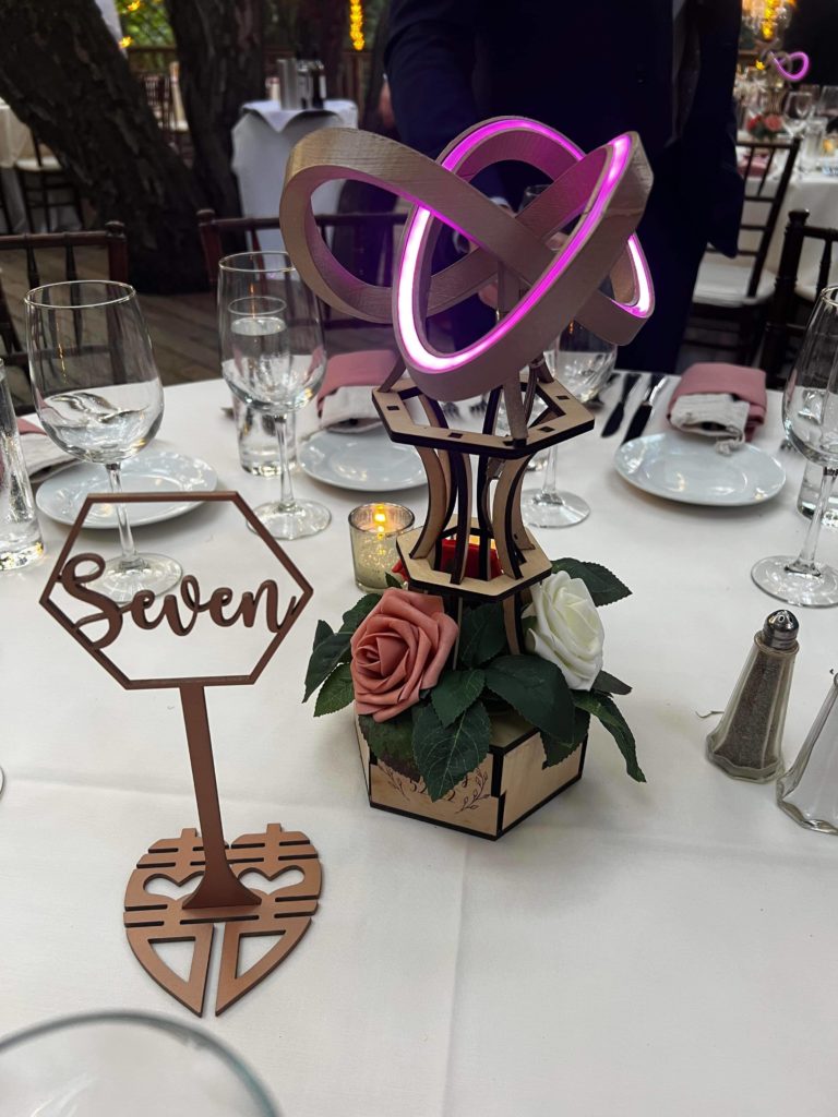
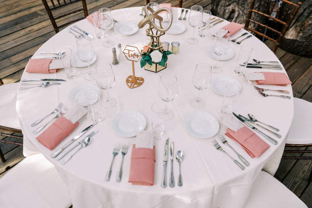
I knew I wanted to make the centerpieces at my wedding even before I knew who I wanted to marry. I didn’t know what form the centerpiece would ultimately take at the outset since I planned on merging both Tiff’s and my tastes. I’m extremely proud of the product we (this was a team effort) ended up with. For those who haven’t seen yet, this is what they looked like: 

Being an engineer, I began the process with a set of product requirements:

  • Symbolic: The centerpiece had to represent Tiffany and I as a couple. 
  • Aesthetic: It had to look good and match the overall theme of our wedding
  • Whimsical / Interactive: I wanted the centerpiece to be somewhat unique and fun. 
  • Manufacturable: About 10 needed to be made 
  • Easy assembly: Obvious for somebody who had never seen it before, with limited instructions
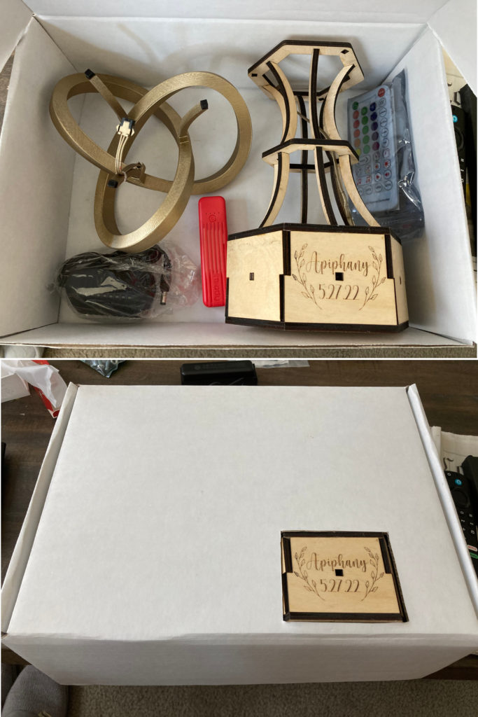
  • Packaging: Simple disassembly and airplane-proof for guests to take home

With the requirements in mind, I began an iterative process of creating components, testing them, and refining them. 

The first component I created was the top lighted portion. The shape is called a trefoil knot and it has a few interesting (for nerds at least) properties which double as symbolic attributes. First, like a ring, it’s made of a single unbroken strand (like marriage). From various angles, it looks almost like a three dimensional infinity sign (representing an everlasting love). The trefoil knot is also nontrivial in the mathematical sense in that it cannot be untied without cutting (insert your own apt marriage analogy here). Another property which made it highly adaptable for lighting in this project is the fact that even though it appears as if the faces twist around, they actually keep the same orientation with respect to each of the other faces (I don’t know enough math terms to describe this properly). In practical terms, it means I could insert a single strip of LED rope and have all the lighting be visible without cutting it into separate sections. 

Didn’t expect to see parametric equations and trig functions? You were wrong 😉

The physical model for the knot was created by extruding a U channel along a curve defined with a set of parametric equations (shout out to IMSA math teachers! I knew this stuff would be useful). I tweaked the parameters for the shape to fit my print bed, fit exactly 1 meter of lighted rope, and have “lobes” that look good.

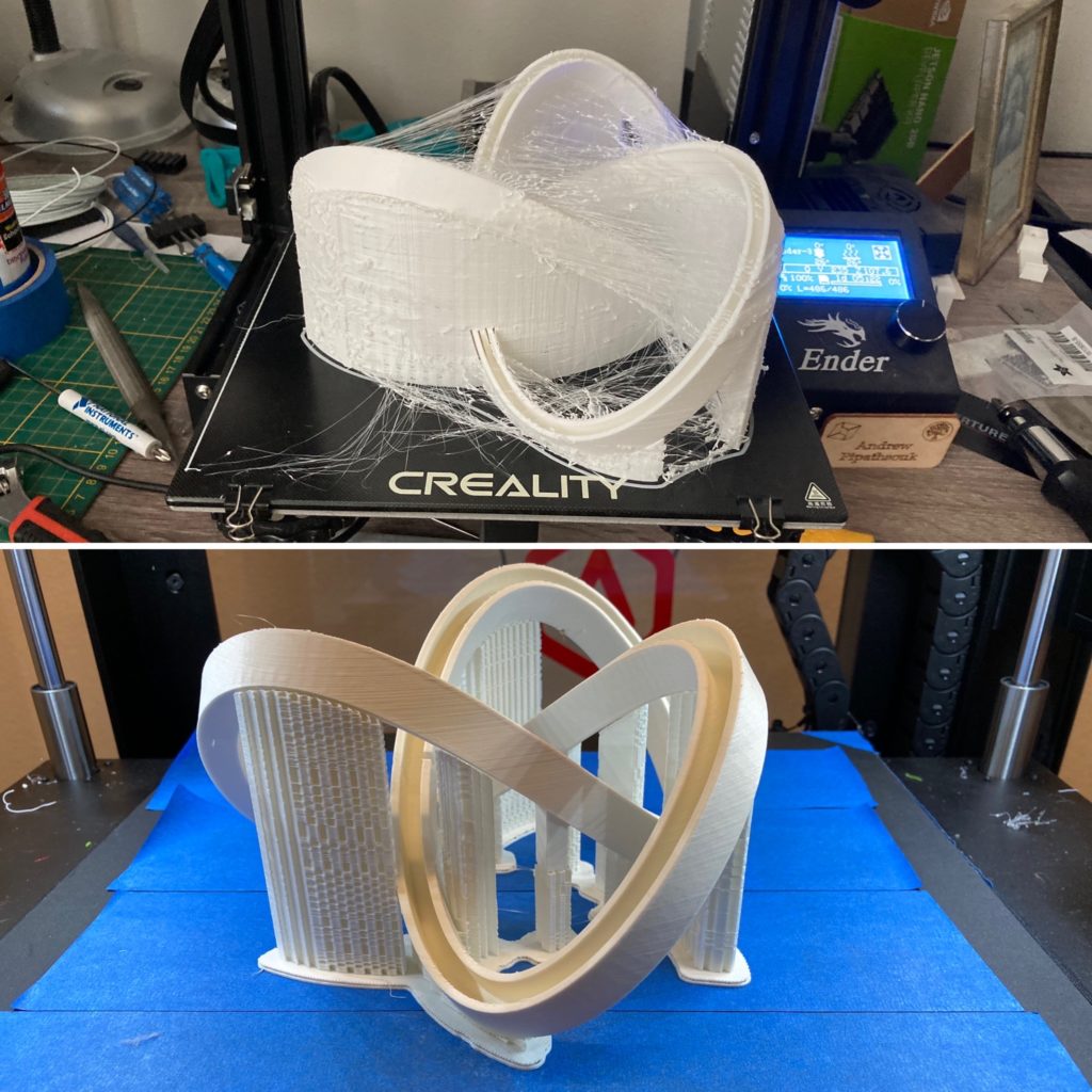
The first prototype print… was a PITA to clean up and prepare, but it did its job

As you can see, my first print (top) had severe stringing and had a lot of overkill in terms of support material which made it a bit of a nightmare to finish. Luckily, I’ve got a bit of experience in optimizing print settings which helped in the production process down the line ;). 

My first prototype trefoil knot used some WS2812 LED strips left over from projects I completed years ago. While it worked as a proof of concept, I didn’t like that discrete LEDs were clearly visible. 

Searching for a replacement, I found a newer LED strip product with super high density (96 LEDs per meter). Additionally, I started the project out by planning to control the LEDs by rolling my own arduino code and creating some basic power management circuitry as I had done in the past, but I was amazed to find integrated controllers (SP511E) which did everything I wanted to and more for cheaper than I could buy individual components (thank you AliExpress!). This awesome little controller has two different power inputs for either battery or wall wart, has an IR sensor for a remote control, has a ton of pre-programmed light patterns, AND has a sound reactive function! Above is a prototype video showing all of this in action. 

The centerpiece design I went with in an alternate universe

I toyed around with the idea of having a vase with flowers inside the trefoil knot for a little bit, but ultimately we decided that the lighting would look better raised. We also searched for and tried multiple color options on both black and white plastic before deciding on gold paint on white. 
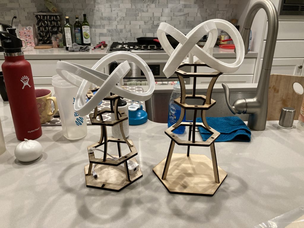
A couple of many design iterations for the centerpiece base

I went through multiple design iterations for the base as well. I optimized the overall height, the number of and shape of the “layers”. Additionally, I had to ensure all the control components could be hidden from view to add to the “magic” factor. 

After finalizing the design and building the functional prototype seen above, we got to work in the production phase…
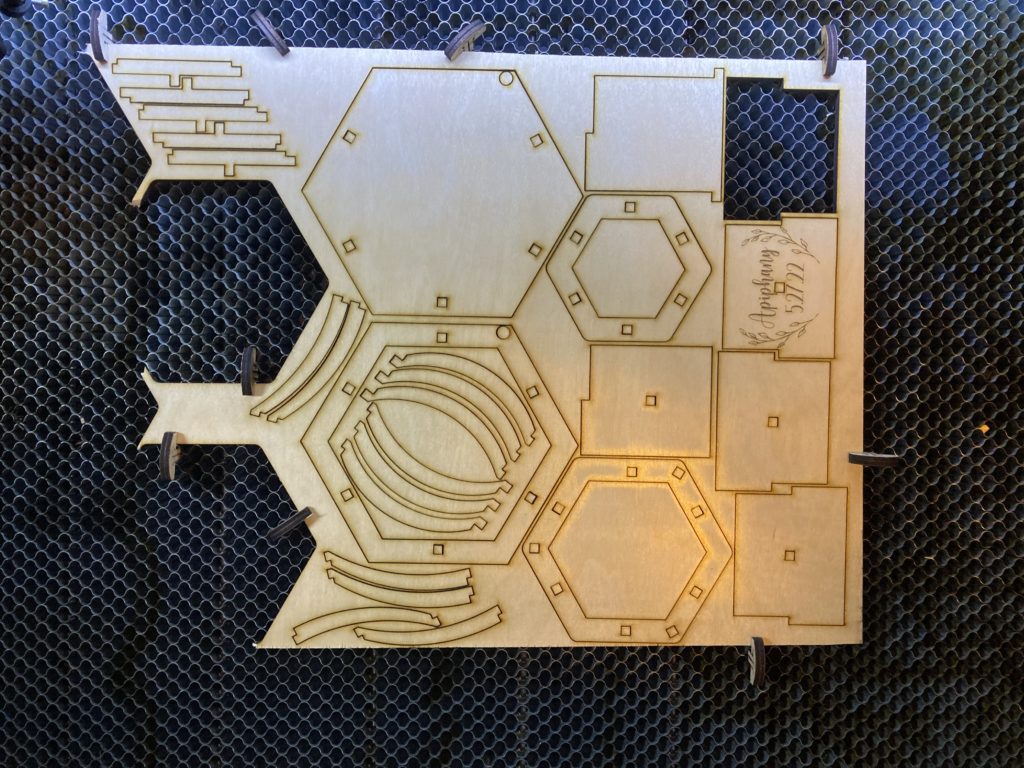
Not only did I need to print about a dozen trefoil knots (each print took ~18 hours), I needed to cut the same number of bases while minimizing plywood waste material. 

This took over our living space for quite a while… Not shown in any of these photos are the hours that Tiffany spent sanding to finish the tops before spray painting, the time I spent trimming and soldering the LED ropes, and the preparation of the floral elements.  

Arguably the most important element of the design is how easy it was to assemble and disassemble… it doesn’t matter how good it looks if nobody else can put it together and take it apart again. I knew I would not have time on the date of the wedding itself to do either, so I put a lot of work up front to make everything as intuitive as possible including: optimizing cable routing, creating sub-assemblies, and writing work instructions. 

Thanks so much for sticking with me for this series for almost a year now. It’s been a ton of fun for me, and I hope it’s been at least somewhat interesting for you :). I want to take this opportunity to once again thank my wife, family, friends, and vendors who all made our wedding special and unforgettable!!

For you readers that have made it this far… Here’s a little thank you video I put together that shows the centerpieces in action at our wedding! 
Designing The Wedding – Part 6

It’s hard to believe it’s already been over six whole months since our wedding, and I haven’t finished this series yet 😅… The holidays have been a bit busier than I expected with my Etsy shop despite relatively little input effort. The post today will be relatively brief, quickly covering everything on our tables sans the centerpieces themselves: the party favors, table numbers, escort cards, and our cake topper, and a bonus faux neon sign.

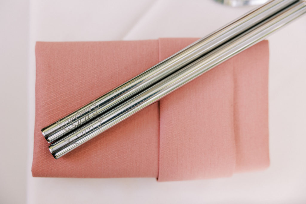
We definitely took advantage of the fact that Tiff’s dad owns both fiber and CO2 lasers. The fiber laser even has a rotary tool–perfect for our party favors: engraved boba straws. Creating the wedding logo in vector format made scaling down  trivial. After engraving, the straws were polished, then stuffed into muslin bags (which were surprisingly difficult to source). 

Engraving on metal like this requires a fiber laser and rotary tool for best results

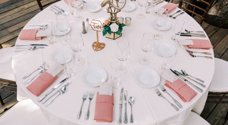
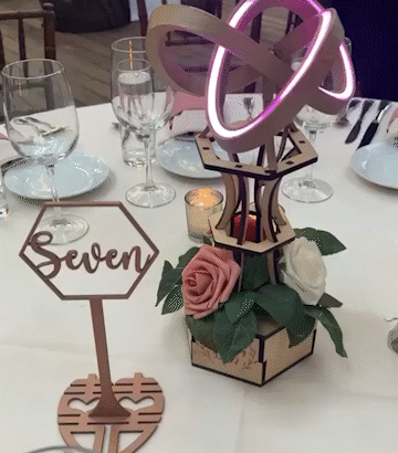
I’m a bit biased, but I REALLY like the design I created for our table numbers. The signs are very ABC (American Born Chinese), using a “weddingfied” double happiness symbol for the base. After the signs were laser cut, Tiff spray painted them to match our wedding colors a bit more closely. While we only ended up having nine tables at our wedding, I created designs for the numbers up to twenty for Tiff’s dad to productize on his Etsy store. There’s multiple ways these could be personalized, from engraving initials, names, dates, or images into the stems, to changing the shape of the standing number, to changing fonts, numerals, etc. Frankly, I think this is the single most marketable item I created for our wedding. 

These simply scream Asian-American wedding to me

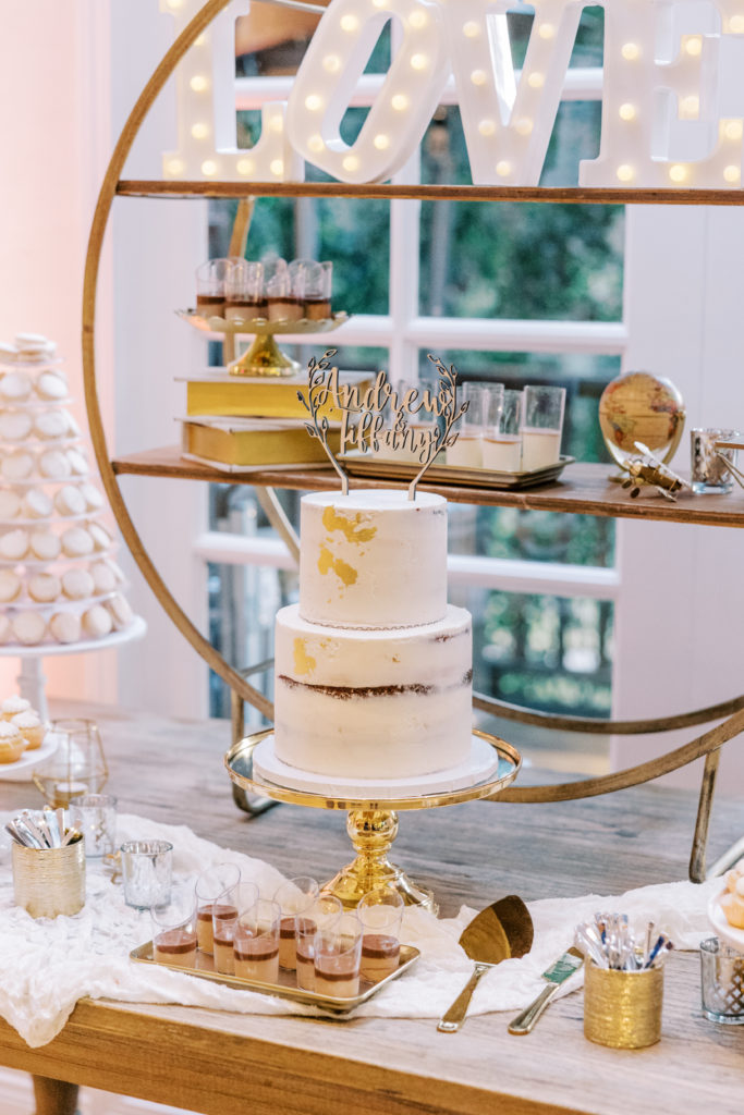
Our cake topper was also made using a laser cutter–nothing super fancy, just our names along with some laurels. It turned out well: 

The topper design went well with the cake’s color scheme

My incredibly generous groomsmen gifted me an Ortur diode laser as an early wedding gift, which proved to be instrumental for creating the escort cards which listed everybody’s names and clearly illustrated their food choice. I really wanted the escorts to be unique and playful–I had a lot of fun designing them. 

I created a Word template in which I loaded everybody’s names and table assignment information. Next, I used my regular laser printer to print the filled templates out on card stock. Finally, I created an alignment fixture on the diode laser table to cut out the cards six at a time with each guest’s food symbol. Getting the fixture right took a bit of trial and error, but mass production was relatively quick once my system was implemented. A big learning for me was how sensitive the laser power was to the slightly different shades of pink–the lighter colors required more power than the darker ones. In hindsight, it’s obvious since the diode uses visible wavelengths and lighter colors reflect more of the energy. 

Unfortunately the cow card isn’t pictured (my personal favorite design)

I think these escort cards are the second most marketable item I created, although I also learned the meaning of the symbols initially eluded some of my guests:

Guest A: “Hmm… what do these symbols on these cards mean?”

Guest B: “Oh! I think I know–it must be the Chinese zodiac–year of the cow and year of the chicken!! Maybe those are when they were born?”

Guest A: “What’s the year of the carrot!??”

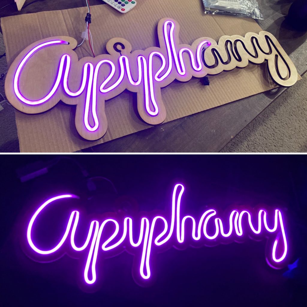
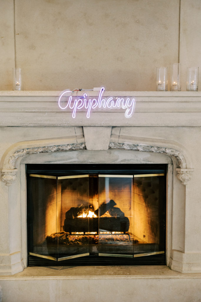
A fairly common wedding fad which has popped up recently is having a faux neon sign created. I learned how much people were paying for having them made, and I laughed. I wanted ours to use individually addressable RGB LEDs, so we wouldn’t be bound to a single color (also so I could hang it up in my workshop after the wedding), so I rolled my own in a few basic steps:

  1. I wrote “Apiphany” in cursive as a drawing on my iPad
  2. I translated this drawing into a vector file
  3. I prototyped my design in cardboard to ensure the bends were not too harsh on the LED strip
  4. I installed the light strip into an acrylic version and attached a controller
Please excuse my prototyping mess…

At the wedding, our brilliant wedding planning team brought along clear fishing line to invisibly hang the sign up:

I believe my next post will be the last one in this series–the only component I have left to talk about is the centerpieces. Hopefully I’ll get to that in a matter of weeks, rather than the months this one took ;). Thanks for sticking with me through these ramblings! 

Designing The Wedding – Part 5

Thanks for sticking with me despite the delayed postings… it’s only been about 4 months since our wedding 😅. This quick post covers a hodgepodge of projects–the personalized elements in our gifts to our wedding party, and the tip jar for our bartenders.

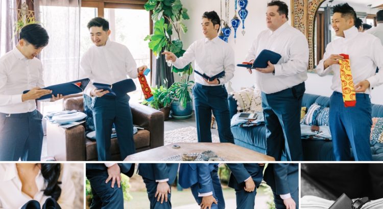
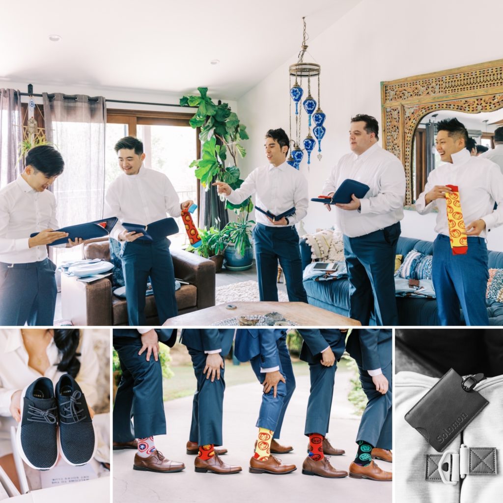
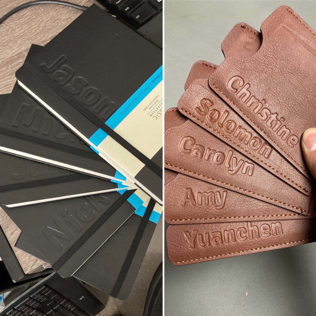
Our wedding party was fairly small–just 4 members on each side–so Tiff and I wanted to give functional and meaningful tokens of our appreciation. For my groomsmen, I gifted duffel bags, personalized luggage tags, personalized Moleskine notebooks, travel tie cases, ties, pocket squares, tie bars, and themed socks :D. For her bridesmaids, Tiffany gifted waterproof shoes, necklaces, robes, and the same personalized luggage tags I made for my groomsmen.

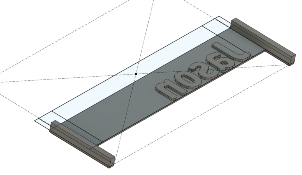
The same process was used to personalize both the luggage tags and moleskine notebooks. First, I designed debossing tools with inverted text and wings to help with alignment:

This press tool was designed to uniformly align the names for each item. Unfortunately, Fusion 360 isn’t the greatest when it comes to creating different configurations, but I made it work by creating feature groups which I manually suppressed and unsuppressed to generate different versions.

It took a bit of experimentation for me to refine the process, but was extremely straightforward to do once I had all the tools set up:

  1. For strength, print the debossing tool with a higher than normal number of walls (5) and infill (50%). Normally, there are diminishing returns on adding more infill, but in this case it was warranted.  
  2. Wet the surface to be imprinted
  3. Add a very stiff backing plate beneath the area to be debossed
  4. Sandwich the component between more flat plates to help spread the clamping force evenly
  5. Clamp down HARD, for at least 15 minutes. Using hard mounted vises makes the work easier.

As one might expect, it was more difficult to emboss larger objects with longer names, since a greater amount of overall force is needed to apply the same amount of pressure (force per given area). 

Having the proper tooling – scrap metal plates and vises made the personalization job much easier than it would have been otherwise…

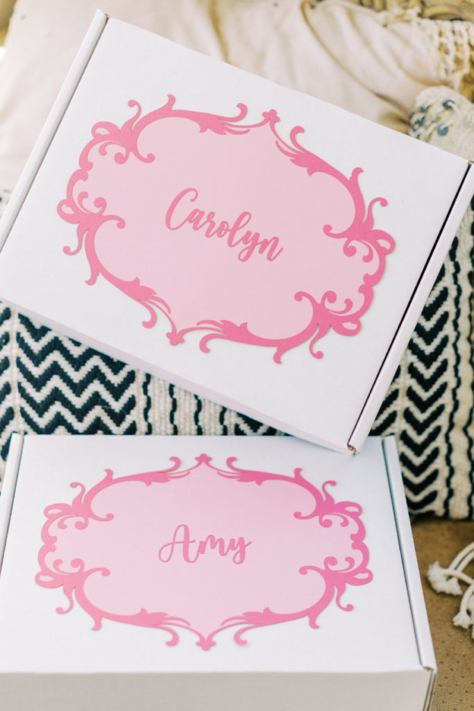
To create the nametags for the bridesmaids’ gift boxes, I used the laser cutter my groomsmen gifted me. I used inkscape to generate vector files to create a background piece, a border to fit on top, and names. Aside from dialing in the diode laser intensity settings for clean cuts in each color, the most difficult part of the project was actually applying the adhesive spray without making a mess.

We used an adhesive spray to attach the dark pink border and names onto the lighter pink background.

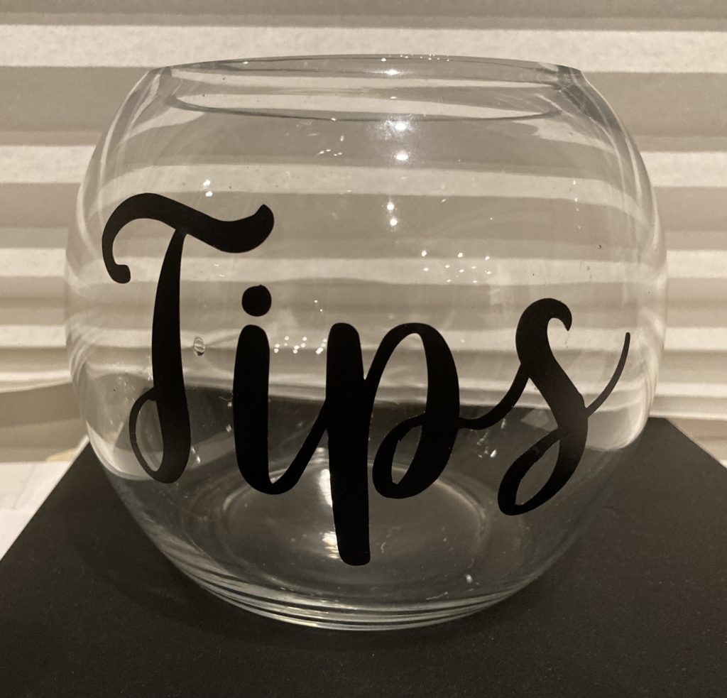
Of all the projects, the tip jar was probably the most straight forward. We found a round glass vase we liked. Then, I used a vinyl cutter to cut the word “Tips” out of a sticker material and used transfer tape to place the stickers on the vase. That’s all it was!

Once again, thanks for sticking with me–I should be able to wrap things up within two more posts, hopefully before Thanksgiving rolls around!

Designing The Wedding – Part 4

Alright, with writing about process and tools done, I’m finally onto the physical builds! We made an above average number of items so not everything fits in a single post. I will be the first to admit that the most exciting part of wedding planning for me was the DIY project part. It’s in my nature to make, so I’m glad that Tiff was on board with everything, even pitching in and toiling away on several projects. While we didn’t make every single item from scratch, we added our own personal flair, so it counts ;).

The very first piece of design work I completed for the wedding was our logo consisting of our couple name (Apiphany) and our wedding date atop two garlands. I created the design in Inkscape as a vector file for easy scaling for application in multiple places. It only took me a few iterations to win Tiffany’s final approval!

Here’s the full 17-item list of things we created for the wedding: 

  • Card box
  • Lantern boxes
  • Guest Book Box
  • Escort Cards
  • Easel Signs
  • Mini Signs
  • Mini Sign Holders
  • Favors
  • Table Numbers
  • Neon Sign
  • Centerpieces
  • Cake Topper
  • Tip Jar
  • Wedding Party Gifts
  • Boxes
  • Customized Luggage Tags
  • Customized Moleskines

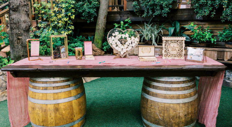
This post will cover some of the items we created for our two tables for the ceremony and cocktail hour — guest book accessories, raffle box, lantern boxes, card box, mini signs, and mini-sign holders. 

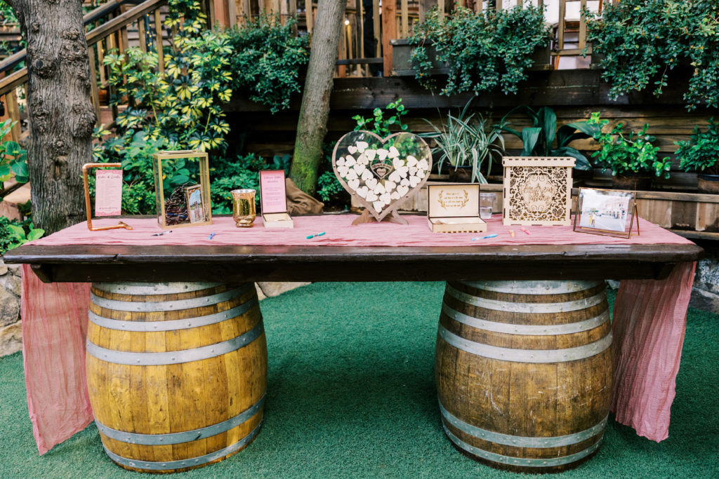
One of the tables at our ceremony with everything this post covers on it

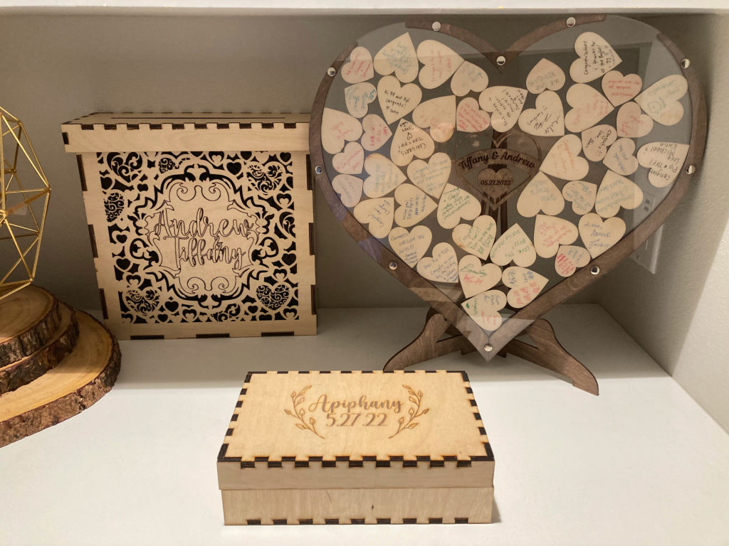
Before we started planning, I knew I wanted one of two styles of more interactive guestbook. The first type I considered was a polaroid book, and the second was a name drop. While we could have borrowed a pair of cameras, we decided against a polaroid book out of a concern of lighting and ease of use. I initially planned on creating my own name drop guestbook, so I purchased a shadowbox picture frame. However, I found a Ukrainian shop on Etsy (https://www.etsy.com/shop/WeddingByEli) who was somehow selling the guestbook (with customization) for less than the cost of materials would be for me. They worked with me going through multiple iterations of the design of the names to get it exactly perfect! I made the purchase nearly a year before Russia’s invasion, and I hope the people at the shop are doing well. The basic idea is that the guests take and sign a wooden heart and drop it into the frame which then serves as a sculpture rather than laying around as a rarely opened book. 

Our guest book and card box now proudly on display at home!

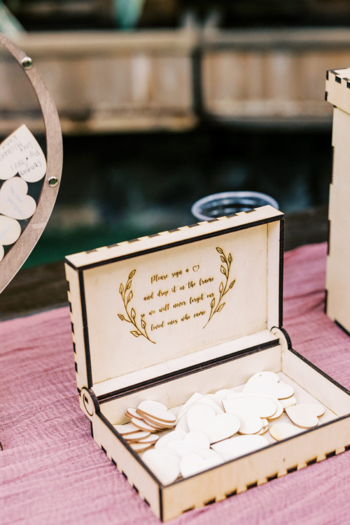
As an accessory for the guest book, I generated a hinged box design using boxes.py (https://www.festi.info/boxes.py/) to hold the blank hearts. I then added engravings of our wedding logo on the lid, and added instructions on the inside. Assembly was straightforward using translucent wood glue and plenty of clamps

I can’t take credit for the poem, it’s a common one used on multiple Etsy listings.

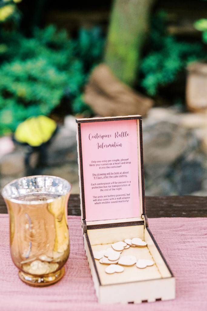
Unfortunately, I mixed up the length and width dimensions for the box the first time I cut it… oops. Luckily, I needed another box to hold hearts for the centerpiece raffle anyway, so nothing went to waste. I printed raffle information and instructions on cardstock then cut them out and glued it inside the lid, covering up the obsolete guestbook instructions XD. 

As you can tell, the width and depth were accidentally swapped in my first hinged box attempt. Luckily I was able to reuse it!

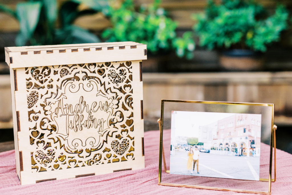
I re-used the boxes.py script twice to generate the basic .svg files to cut our card collection box–once for the main box itself, and one for a slotted lid. This was very easy to do since the script gives the option for entering both inner and outer dimensions. I then modified the base vector files by adding a slot in the lid and our names along with a huge amount of detail to be cut out for the front of the box. 

Box to collect cards from our guests

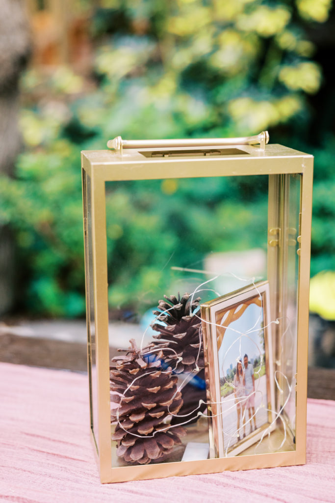
We borrowed lantern boxes from Tiffany’s matron of honor and reused them exactly as she did at her wedding… We stuffed them with pinecones, fairy lights, and added mini framed pictures of ourselves in them. I loved how they turned out!

We lifted these directly from YY and Stefan’s wedding, but why fix what ain’t broke?

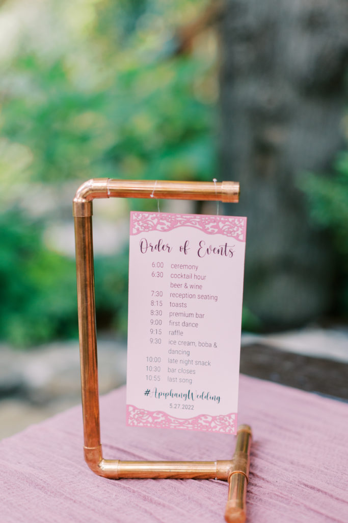
The last thing I will cover in this post are the mini signs and copper pipe holders we created to hold them up. The design of the holder was a simple C with perpendicular stabilizers. I arrived at this configuration to maximize the four 1ft lengths of copper we purchased. The cut list I derived demonstrates the only true advantage I feel imperial units have over metric–the 12 inches in a single foot were easily divided into fairly whole numbers:

Bar 1Bar 2Bar 3Bar 4
Cut 1994.54.5
Cut 2334.54.5
Cut 333
Total Length:12121212

As a bonus, the C-shape also minimized the number of fittings needed (2x L’s, 1x T’s, 3x endcaps for each sign). Somewhat surprisingly, the most difficult part of the process was fixing the pipes into the fittings. Plugging the pipes into the fittings straight up resulted in too loose of a fit. Using teflon plumbing tape looked very ugly. What ended up working very well was carefully adding a mess of hot glue into the fitting and jamming the pipe inside before the glue hardened. I may or may not have dropped a fitting cause copper is a great conductor ;). The signs were created by printing the schedule onto cardstock and gluing on the detail pieces which were laser cut from a differently colored cardstock.

Mini copper pipe sigage

Thanks for making it this far, I’ve only covered about a third of the project list (the most basic ones at that), so there will be a few more posts in the near future! I know I’ve been a bit slow on getting these posts out, but they’re coming!
Oil Screen Hook

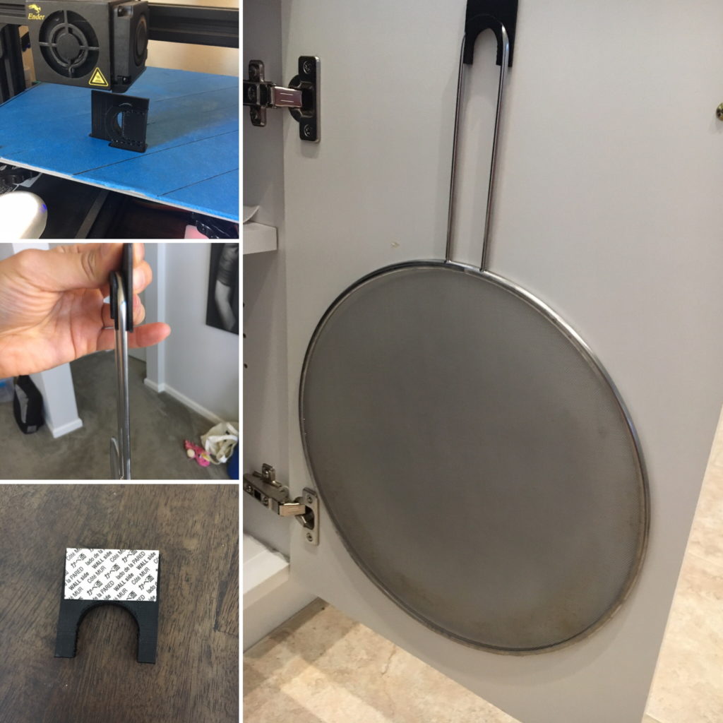
TL;DR: I designed and printed a custom hook to store our oil screen on the back of our cabinet door to save some space.  

Inspired by similar projects seen in various places online, I spent about an hour’s time measuring, designing, and printing a small custom hook to hang an oil screen on the back of a cabinet door.

Due to the simplicity of the part and the application, I decided to spend some time making deliberate choices to optimize performance. First was the design of the part itself. While I could have used a generic 3M command hook to achieve a similar effect, the tight custom fit of this hook prevents excessive movement and noise. Second, I decided to use PETG instead of PLA, a no-brainer for when strength is required. My last optimization was in the chosen print orientation. Despite requiring more support material, the orientation I used is actually ideal for the loading expected in this application. FDM printed parts are weakest parallel to the layer lines—that is, they are susceptible to delamination when loads pull the layers apart.

Quick project to save space in our pan cabinet.

That’s pretty much all I’ve got–here’s to a year full of fun projects in 2021!
Bailey Slow Feeder

TL;DR: I printed a slow feeder bowl for Bailey out of food safe filament and coated it with an FDA-compliant food safe resin. It works, but I think she hates it and me for making it.

I’ve wanted to experiment with 3D prints out of PETG for a while, and finally found some time to do so during this long Thanksgiving weekend. PETG (polyethylene terephthalate glycol-modified) is a 3D-printable plastic with numerous advantageous properties:

  • High strength
  • High density
  • High temperature
  • UV resistant
  • Food safe

The drawback is that it is a bit trickier than PLA (the most typical home 3D printed filament) to print. I invested an hour’s worth of time to adjust settings and complete two quick test prints before deciding I dialed my printer in enough to start a real project.

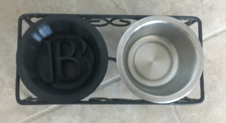
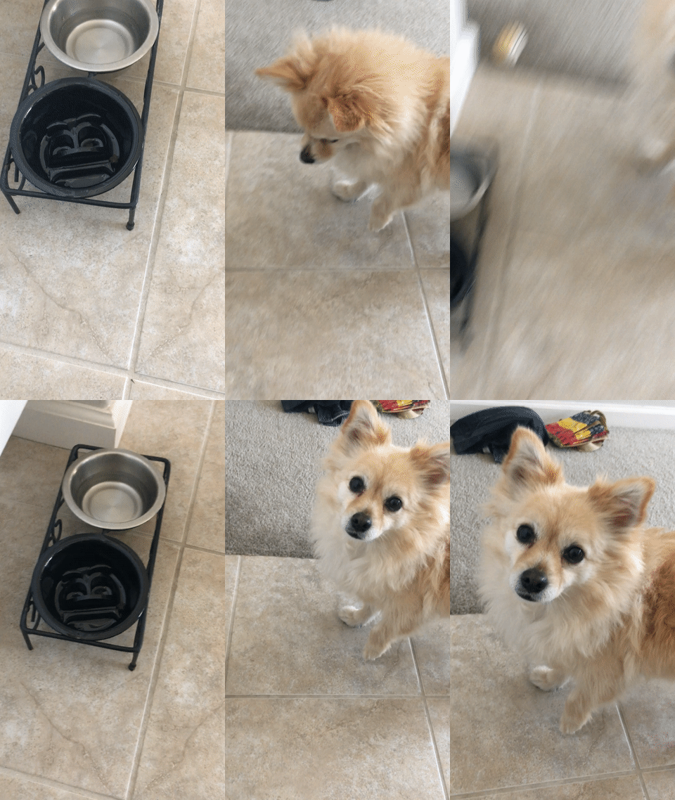
Our dog Bailey is a voraciously fast eater and I recently learned that various slow feeder bowls existed. However, most of the products on the market seem designed for larger dogs, and I wanted to make something that would fit in our existing holder. Spoiler image below:

Bailey’s custom slow feeder bowl fit perfectly!

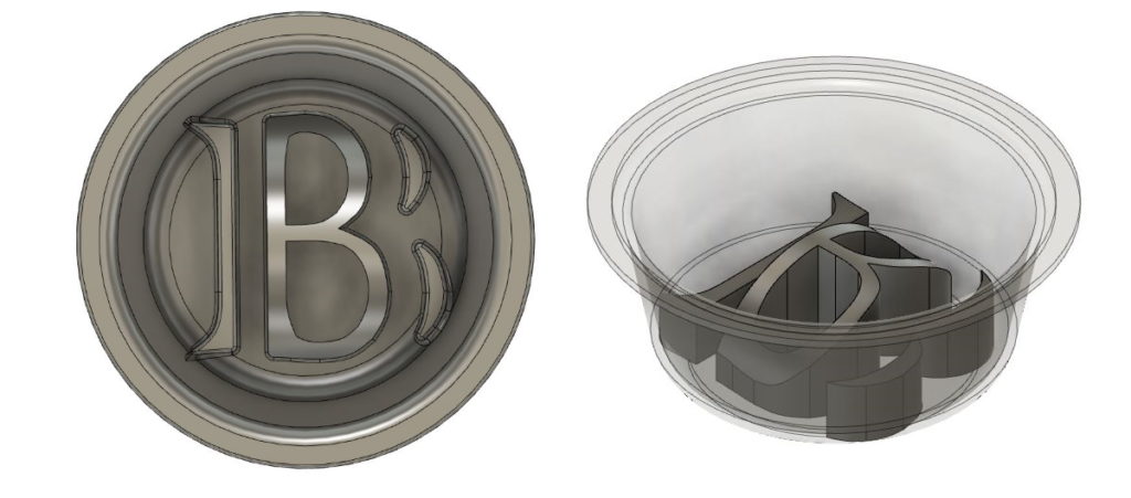
The design of the bowl was straightforward. I measured the dimensions of our existing metal bowl, added another mm of thickness of the bowl for strength, added an extruded “B” in the middle to act as an obstacle, and finally made some cuts in the B to allow Bailey to access all the nooks and crannies. I took care to fillet any sharp edges away to ensure safety:

Left: Top view, Right: Iso view. I cut the “B” into an arch so Bailey could reach all the food and made sure to fillet all sharp edges.

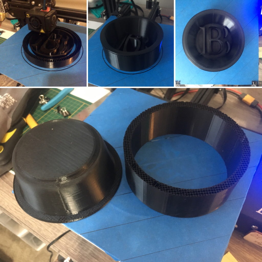
The quality of my first real PETG print exceeded my expectations… Based on troubles I’ve read about people having, I expected some blobs/zits or stringing issues, but surprisingly, I didn’t have any real problems at all. The ease of support material separation was shocking too–99.8+% of my support came off in a single piece, and the remaining two pieces were easily removed with pliers:

Top: 3D print in various stages of completion. Bottom: Removal of support material. I was surprised at the great quality, high strength, and ease of support material for my first PETG print.

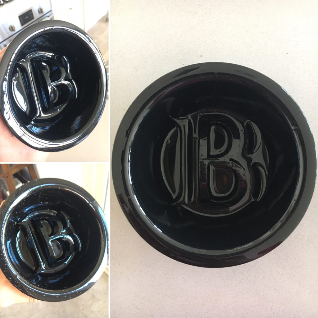
After the print was complete, I coated the bowl with this neat FDA 21 CFR 175.300 compliant resin I bought a while ago but hadn’t tried out before. The biggest pain point with the coating process was the 48-hour cure time.  Luckily this was a long weekend, haha.

Right: Top view of bowl post resin. Left-Top: Showing off shininess of the bowl. Left-Bottom: Water beading up on the print after washing. Not pictured: 48 hours of waiting, and the popsicle stick, old tofu container, and paintbrush all sacrificed to make this happen.

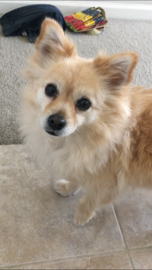
After washing the bowl with soap and water, I tested it out with Bailey by putting in a few training treats. She did not look very happy…

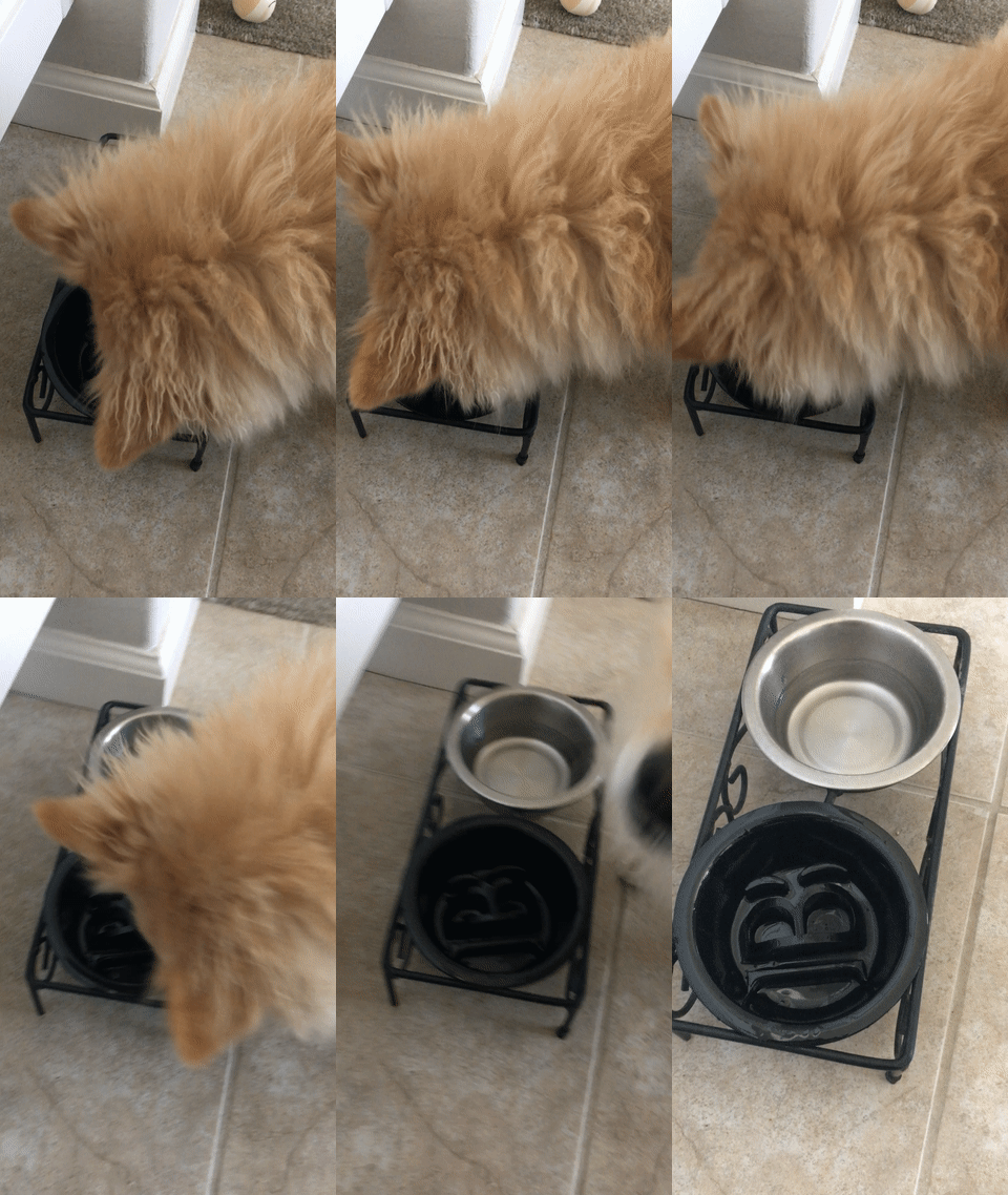
She eventually came around to eating, but clearly wasn’t happy:

I hope she doesn’t hate me forever because of this…

Does she look most annoyed, confused, angry, or disappointed?

Baymax Cord Lock

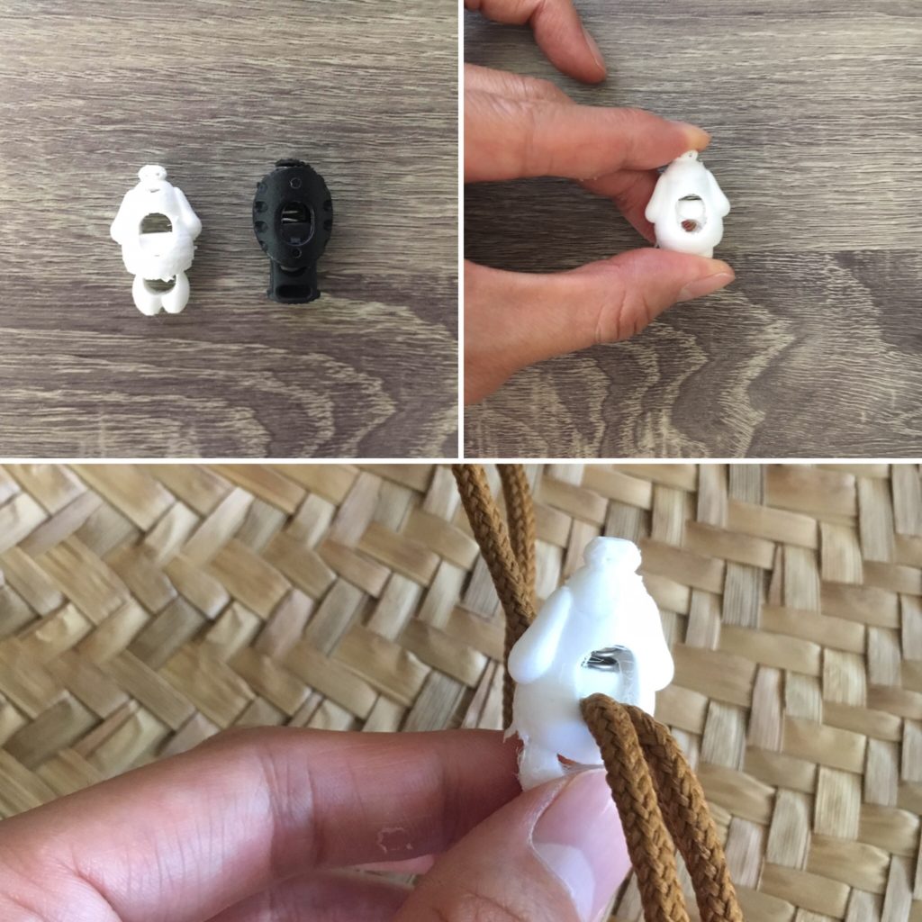
TL;DR: A cord lock for Tiff’s hat broke… so I made a replacement shaped like Baymax since I had white material installed in my printer and I was too lazy to change it, haha.

Tiff got a great sun hat from a friend’s beach birthday party last year. I use it almost every day when walking Bailey. I noticed that the cord lock was starting to break, so I decided to make something useful while scratching my maker itch now that the need for PPE has declined.

Since I currently have black TPU (an elastic material not really suited for this application) installed in one printer, white PLA installed in my other, and a severe lazy streak, I needed to design something white and ovoid.

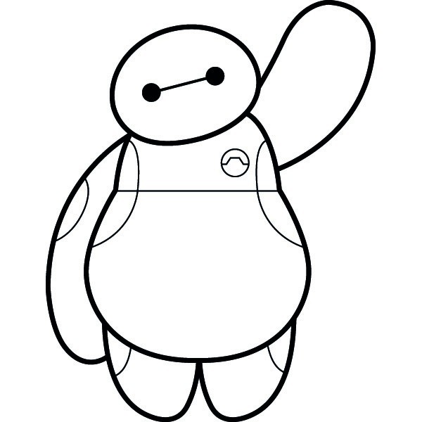
White? Check. Ovoid? Check. Fun? Check Check Check.

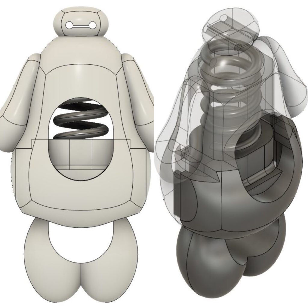
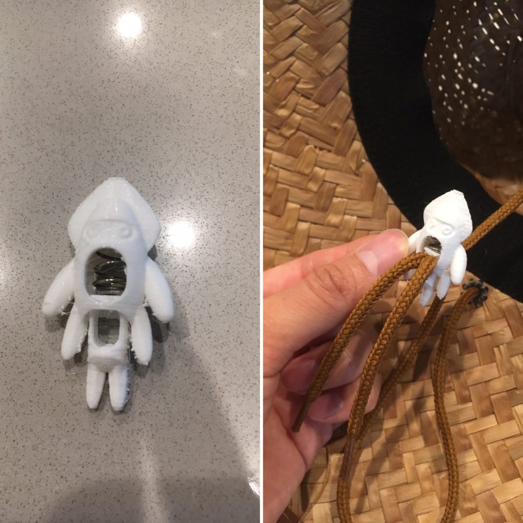
With proper source material in place, knocking out the design was straightforward for me. I decided to use the sculpting tools in Fusion 360. Sculpting is great for quickly making organic shapes that don’t require a lot of exact dimensions. Fusion makes it super easy to combine sculpted forms with parametrically defined features as well. I split Baymax’s body into two parts, one main body and a removable front plate to install the spring and legs.

Sculpt and boolean tools in Fusion 360 made designing and cutting the parts up for 3d printing a breeze!

Since the part was very small, I initially had some troubles with Cura deciding some areas (primarily the cut out for feet to retract into the body for cord installation) were so thin that I must not have wanted material there. I solved this problem by reshaping the Baymax body a bit and scaling the parts up by roughly 15%.

Functional? Check.

Overall, I’m pretty happy with the results… despite it looking slightly terrifying, IMO… like Baymax lost a fight. Maybe I should have gone with some sort of squid ¯\_(ツ)_/¯.

As always, hope everybody is staying safe and healthy!

UPDATE: 7/25/2020:

Looking at the Baymax cord lock I made last week depressed me because it looks like his body is getting pierced by some sort of tentacled foe. I decided to replace it by designing a Blooper (the squid thing from Mario games), since it is also white, but looks natural with long arms:

I think Blooper looks better than Baymax cause the strings are tentacles XD

I used all the same tools I used for Baymax to make Blooper, but it was much faster the second time around. While I like this cord lock looks better, but Tiff doesn’t like it because of all the legs, hahaha ¯\_(ツ)_/¯.

Window Sill Shelf

TL;DR: It gets hot in SoCal so I overengineered a shelf to hold a fan to blow cool air into our bedroom at night.

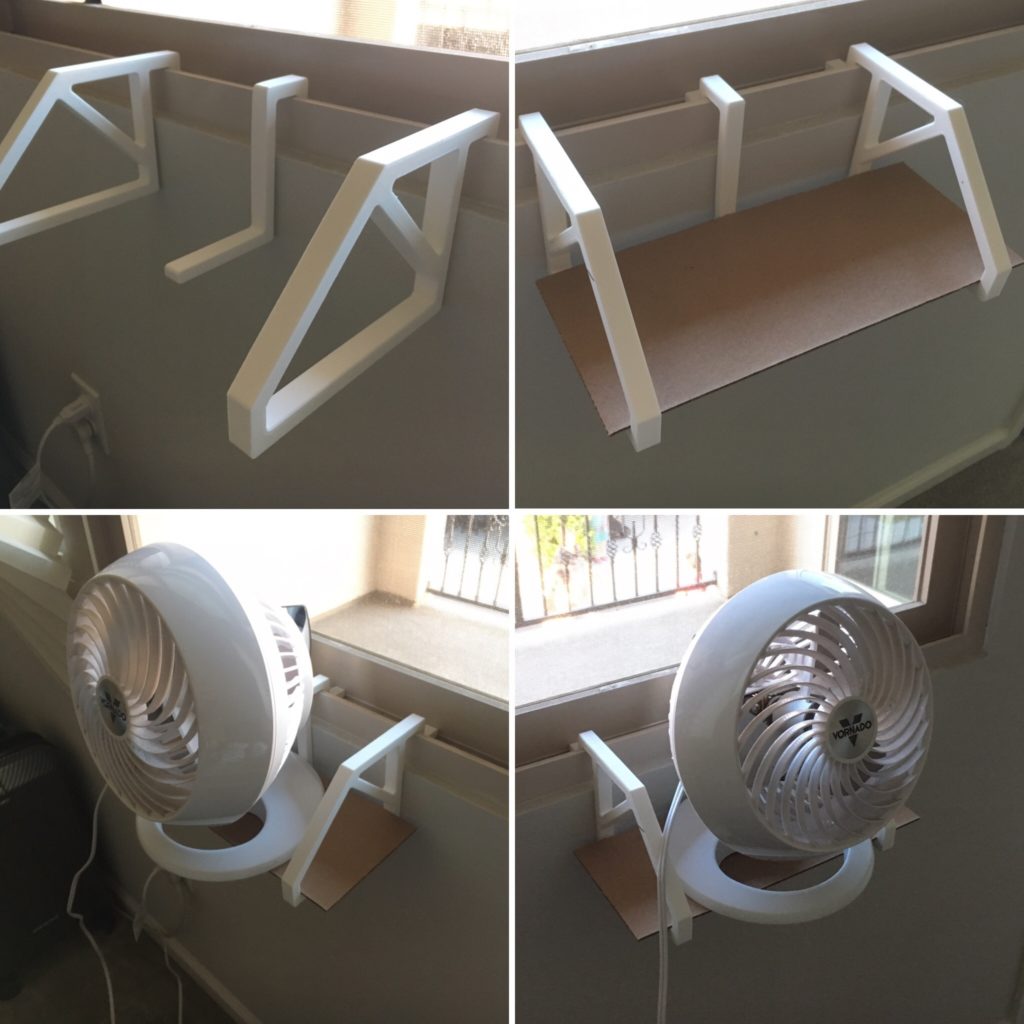
Just a quick post this time—I decided to put my printer to work making another functional print! SoCal is a desert, so it gets very hot during the day, but cooler at night. A few days this past week were especially brutal. To help circulate the air at night, we use a little Vornado fan, but its effectiveness wanes when it doesn’t have access to cooler air.

A simple, but effective design. I originally intended to print the shelf itself too, but I found a piece of wood that I’ll cut later to eliminate the use of this piece of cardboard, haha.

I designed a very simple shelf comprised of brackets, a brace, and the shelf itself. I sized the brackets specifically for our bedroom windowsill. There is a very satisfying click during installation, but the shelf is very easily removable in case we need to close the window.

I didn’t end up printing the shelf part because I found a piece of spare wood which will work perfectly, and I installed a piece of cardboard until I find time to cut it. Although this specific design isn’t super generalizable, I decided to upload it to thingiverse anyway in case anybody is inspired to made minor modifications to fit their needs:

https://www.thingiverse.com/thing:4462927

Stay safe and healthy!

#BlackLivesMatter Gear

TL;DR: I believe #BlackLivesMatter. I still can’t say anything more eloquently than what has been said by others elsewhere, so I’m going to chip into the cause in my own way. If you’ve donated to a reputable social justice charity, I’m more than happy to send you some 3D Printed #earsavers or touch-free door openers.

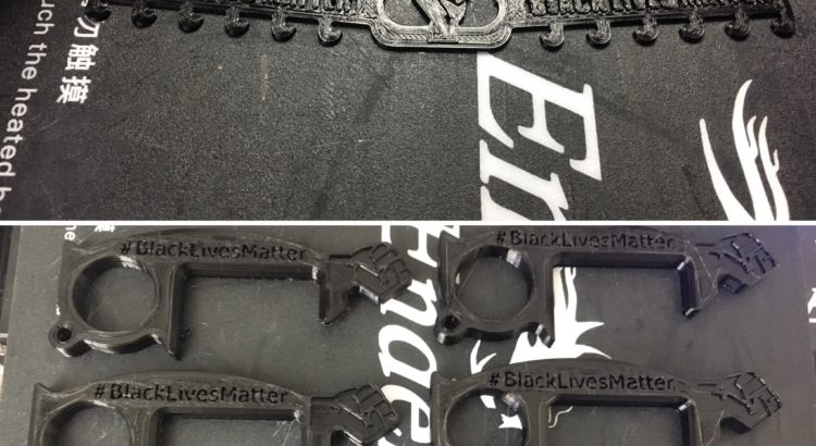
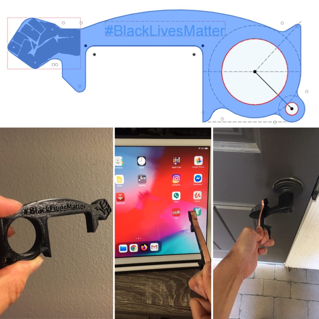
Despite law enforcement agencies across the country telegraphing they don’t believe so, black lives do matter. To help the cause in a small way, I designed a new earsaver and a touch-free door opener/keypad stylus.

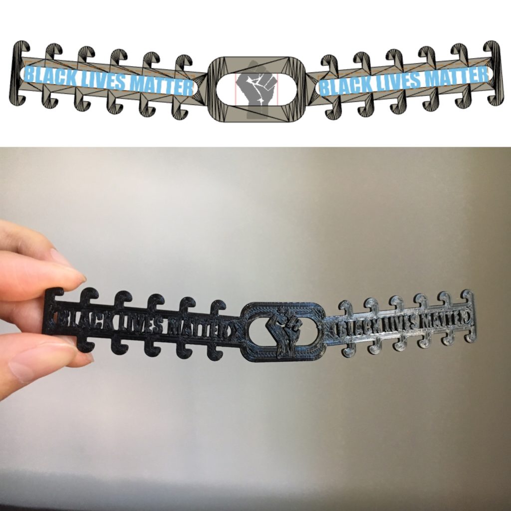
The earsaver is a modified version of the NIH-approved design found here: https://3dprint.nih.gov/discover/3dpx-013615. No critical outside dimensions were altered, and the part remains very flexible. Earsavers are very useful for anybody who needs to wear a mask (aka EVERYBODY WHO LEAVES THEIR HOME). You put this on the back of your head and hook your mask straps around it instead of around your ears. This takes the pressure off your ears and makes wearing the mask much more tolerable.

I modified an NIH-approved design to allow wearers to show solidarity with the movement.

Creating the door opener/stylus was a bit more involved; I created the design from scratch, using a few existing designs as inspiration. The hook is useful for opening door handles without touching the surfaces. A strip of copper tape wrapped around the fist allows the stylus to function on capacitive touch screens, as long as you touch the bottom of the strip with your thumb. This is useful for pressing buttons at the self-checkout line in grocery stores.

This touch-free door opener doubles as a stylus useful for hitting capacitive-touch buttons at self-checkouts. The strip of copper tape is the secret-sauce which allows this functionality.

If you’d like some of these doodads, I’m happy to send them to you free of charge. Since I literally finalized the design at lunch today, I don’t have a huge stockpile right now. For now, I’m going to prioritize those who have donated to reputable social justice related charities, but I aim to eventually provide these for anybody who wants them, so feel free to reach out!

COVID: Endgame

TL;DR: Since the acute need for PPE has diminished, I am no longer producing parts on regular basis. However, I do have a reserve of face shields and earsavers remaining, and am more than happy to ramp up production if you or anybody you know need equipment.

Over the past 8 weeks, I personally manufactured about 1000 face shields and 1000 ear savers on my two 3D printers, delivering a quantity of about 880 of each to healthcare friends and friends of friends in places all over the country including: LA, SF, OC, Oakland, Tennessee, Oregon, South Carolina, Georgia, and New York. Furthermore, two local groups I work with have distributed over 75,000 and 22,000 face shields and other units of PPE, respectively.

However, it appears that more and more hospitals are getting their supply chains back in order, and the shortfalls do not seem as desperate as they were a few weeks ago.

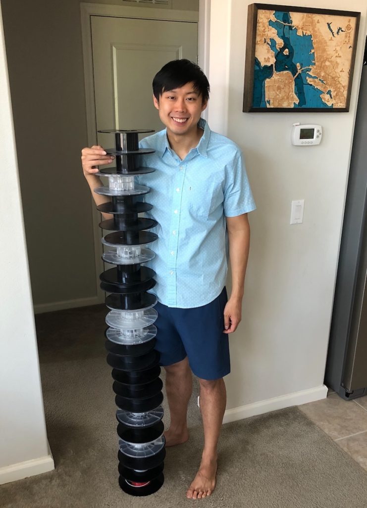
This is what ~50 lbs of empty filament spools looks like

I feel this was a huge accomplishment, and I could not have done it without the support of everybody who chipped in for expenses—it was incredibly generous of you. I plan to donate the remaining funds to the charity Good360 in a few weeks if the need remains low and seems unlikely to ramp up in the short-to-medium term.

I hope everybody has a wonderful Memorial Day Weekend, and stays as happy and healthy as possible. I sincerely hope enough of us remain vigilant and change our habits enough to ensure the gains and sacrifices we’ve made the past few weeks are not wasted. I pray that the worst of this situation is truly over for us. However, if there’s one silver lining to this, I know that if the need for more PPE arises again, we’ll be able to ramp back up much faster next time.